
Inconsequential Information
Parking application greets users with a confusing modal.
Problems:
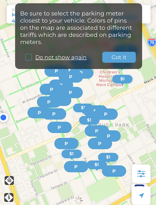
All the pins are blue.
The city charges a flat rate of one dollar per hour, everywhere.
I emailed support, because I was curious about this. They replied that it was possible the city could change rates at some point in the future.
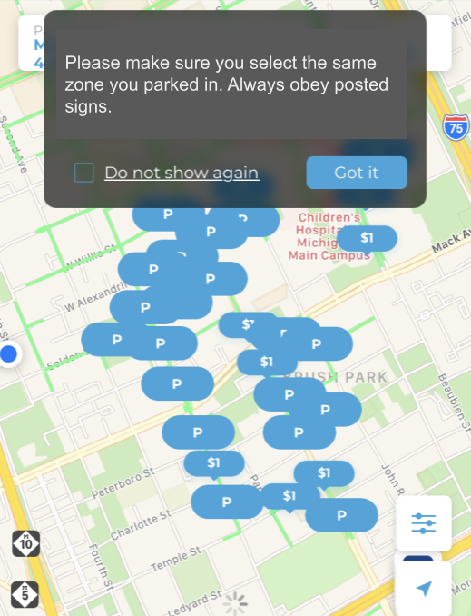
Selecting the nearest meter also ensures you have selected the correct zone. Tariffs remain the same but the rules that govern parking change throughout the city. Knowing the correct zone eases enforcement and allows the app to warn users when their time is about to run out.
Solutions:
Fewer words makes it easier to understand and takes up less of the user’s time.
Doesn’t bother the user with information about a planned color coding system.
Modal now conveys actionable information to the user. Selecting the correct zone allows the app to perform its function correctly. It’s also much easier to see the zone number, printed on signs along the street, than to try to estimate which meter kiosk is closest to your car.
If and when the city changes the prices the app could always append the modal with text like: “pins are color coded by price.”
Don’t bother users with information they don’t need
Future-proofing a parking application to allow for price changes makes good design sense. Explaining this unimplemented feature to the user just confuses them.